CTC Smart Client Generator - Custom Controls
Custom Controls are controls that extend Standard Controls to implement specific requirements or to take advantage of Third Party and additional HTML controls.

Custom Controls are used for substituting Standard Controls on the generated form when the User Interface requirements demand an interface that cannot be satisfied by the standard controls. Using the CTC Configurator, Standard Controls can be substituted with Custom Controls. See the Online Documentation for further details.

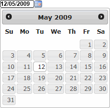
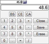
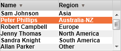
Included with the CTC Smart Client Generator are a number of Custom Controls. These can be used out of the box or changed to suit local requirements. The source code of the Custom Controls is part of the installation package.

The following lists the Custom Controls that are delivered as part of the CTC Smart Client Generator:
Custom ControlDescription
DatePicker

This extends the standard TextBox control where date input is required.

The DatePicker is a jQuery UI control. It provides a popup calendar control for easy date selection in date formats suitable for EAE and AB Suite.

The jQuery UI library is automatically installed with the CTC Smart Client Generator.
Calculator

This extends the standard TextBox control where a calculator is required.

The Calculator control provides a dropdown calculator for easy calculation of a value to be inserted into the field.
DataGrid

This extends the standard ListBox control.

The Data Grid is a CTC control. It is a flexible control with many options such as column headers, column sorting, data layout and styling.
Slider

This extends the standard TextBox control.

The Slider is a jQuery UI control. It changes a TextBox control to a graphical slider that allows the user to choose a numeric value from a range. The Slider's orientation can be horizontal or vertical.

The jQuery UI library is automatically installed with the CTC Smart Client Generator.
Hyperlink

This extends the standard Label control.

The Hyperlink custom control is used for substituting label controls where the label text has been specified as the html anchor control.
I.e.: <A HREF='http://www.ClientTools.com.au'>Client Tools Consultancy</A>

The Hypelink control is a standard HTML control.

Kendo UI ComboBox

This extends the standard CTC ComboBox control.

It allows the use of the ComboBox control provided by the third party Telerik Kendo UI as an alternative to the standard ComboBox control.

The Kendo UI ComboBox provides a different look and feel. It supports Dropdown Styles 'dropdown' and 'dropdownlist' only.

See the CTC Smart Client Generator Readme file for instructions on how to obtain and install Kendo UI Web Controls.
Kendo UI Chart Control


This extends the standard ListBox control.

It allows the use of the Chart control provided by the third party Telerik Kendo UI.

The Kendo UI Chart control provides easy charting capabilities of various chart types such as Column, Bar, Line and Pie.

See the CTC Smart Client Generator Readme file for instructions on how to obtain and install Kendo UI DataViz Controls.
Map Popup Control

This extends the standard TextBox control.

The Map Popup control can be attached to a group of address fields and show the address on a map. The Map Popup control is utilizing the Google JavaScript Map control.

See the CTC Smart Client Generator Readme file for instructions on how to obtain and install Google Map API Control.
CopyFrom List Control

This extends the standard CopyFrom Grid control.

The CopyFrom List control can substitute a CopyFrom area in which all fields are inquiry only fields. The CopyFrom List control will create a list of all rows in the CopyFrom area by automatically returning to the host as many times as required to retrieve all rows for the CopyFrom. The list will be displayed as a DataGrid allowing the user to scroll through the data and sort on columns.

The CopyFrom List control requires the 'CopyFrom As Grid' option to be set to true.
Check Box, Radio Button Controls

This extends the standard Check Box and Radio Button control.

By setting the option ‘CheckBoxRadioButton CustomControl’ to true, the standard icons of the Check Box and Radio Button will be changed to custom icons that can be styled to suit individual styles. The icons scale up/down with the font size and grid lines can be applied.
Maint Buttons Control

This extends the standard Button Group control.

This control allows generating customized buttons for the Maint field including icons on buttons and custom style.

With this control the Maint buttons can be positioned anywhere on the User Interface. This allows positioning the buttons in a fixed position outside of the form enabling quick access to the Maint buttons regardless of whether the ispec form is scrolled.
Input Mask Control

This extends the standard TextBox control.

The Input Mask control shows a mask in the text input box of a predefined format, making it easy for the user to enter data in the correct format.

The control is based on the jquery "RobinHerbots/jquery.inputmask" plugin. For details on the control see: https://github.com/RobinHerbots/jquery.inputmask
Field Masking Control

Examples:
Data: 123456789
Masked value: *****6789

Data: 123-45-6789
Masked value: XXX-XX-6789

Data: 123456789
Masked value: XXXXX6789
This extends the standard TextBox control.

Field Masking is used for masking values entered and displayed in a TextBox control. This allows obscuring values such as Social Security Numbers and Credit Card Numbers.

The value is shown unmasked when placing focus on the control allowing to modify the text. The value is shown masked when leaving the control and focus is elsewhere.
Kendo UI Gauges

This provides an example of additional controls that can be added to the form at generate time.

This utilizes the Generic User Control specifying the template for the gauge control.
Password Show/Hide


This extends the standard TextBox Password control.

By default, this control Shows and Hides the password when clicking on the eye icon.

A Peek option reveals the password on mouse down on the eye icon and hides the password when releasing the mouse.