
|

|
 |
Home > CTC Generators > Smart Client Generator > Features |
| CTC Smart Client View Controller | Top of page |
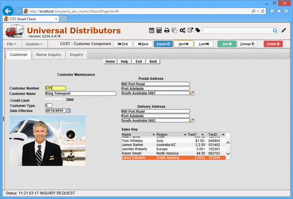
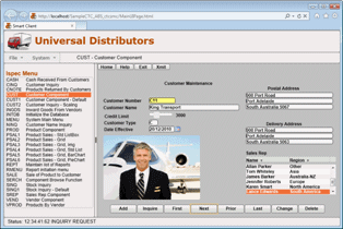 CTC Smart Client View Controller (PC View) |
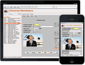 CTC Smart Client View Controller (Tablet/Phone View) |
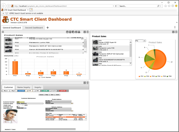
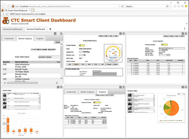
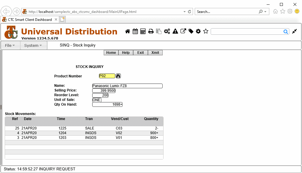
| Dashboard | Top of page |
| Custom Controls | Top of page |
| Date Picker | Top of page |
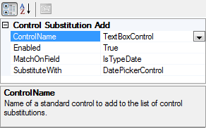 TextBox configured to be replaced with DatePicker for Date Fields |
 Standard TextBox Date Field 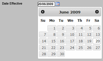 DatePicker Control replacing the TextBox Date Field |
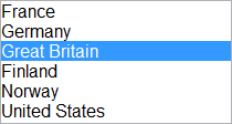
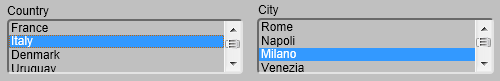
| List Box | Top of page |
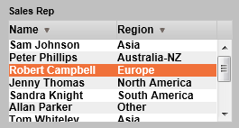
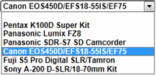
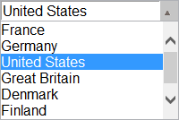
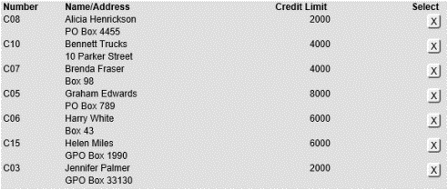
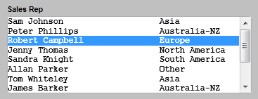 Standard List Box Control |
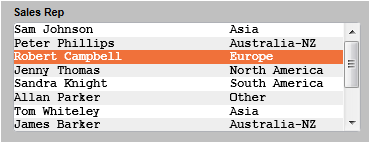 List Box with Alternate Row Style |
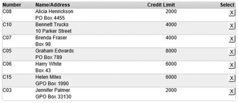
 Standard List Box Control |
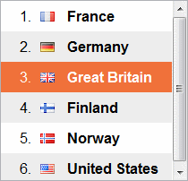
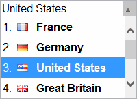
 List Box with Custom Formatting, Images and Alternate Row Style |
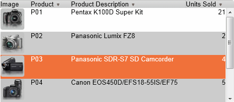
 Standard List Box Control |
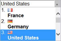
 List Box with Item Number, Images and Alternate Row Style |
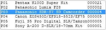
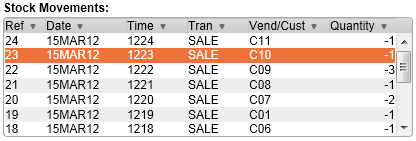
| Data Grid | Top of page |
|
Standard List Box Control |
 Data Grid replacing the Standard List Box with Multi Columns, Column Headers and Sorting |
|
|
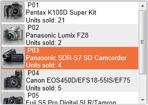
Standard List Box Control |
 Data Grid replacing List Box with Multi Columns, Column Headers, Sorting and Images |
|
| Custom Check Box and Radio Button | Top of page |
 Standard Default Check Box Grid lines |
 Custom Check Box Icons on Left Grid Lines |
 Custom Check Box Icons on Right |
 Custom Check Box No Icons Grid Lines |
 Custom Check Box Icons Buttons Grid Lines |
 Standard Default Check Box Grid lines |
 Custom Check Box Icons on Left Grid Lines |
|
 Custom Check Box Icons on Right Grid Lines |
 Custom Check Box No Icons Grid Lines |
 Standard Default Radio Button Grid lines |
 Custom Radio Button Icons on Left Grid Lines |
 Custom Radio Button Icos on Right |
 Custom Radio Button No Icons Grid Lines |
 Custom Radio Button Icons Buttons Grid Lines |
 Standard Default Radio Button Grid lines |
 Custom Radio Button Icons on Left Grid Lines |
|
 Custom Radio Button Icons on Right Grid Lines |
 Custom Radio Button No Icons Grid Lines |
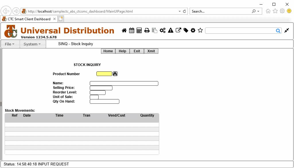
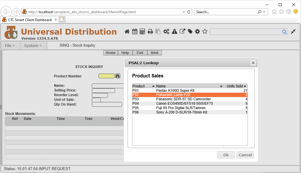
| Lookup | Top of page |
| Charting | Top of page |
 Standard List Box Control with Multi Columns |
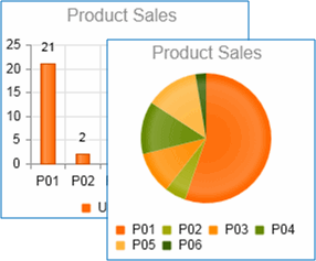 Charting Control replacing the Standard List Box Control |
| Calculator | Top of page |
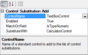 TextBox configured to be replaced with Calculator for Numeric Fields |
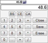 Calculator Control replacing the standard TextBox |
| Map Popup | Top of page |
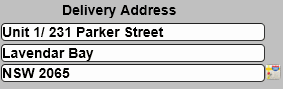 The Map Popup Control attached to a group of address fields |
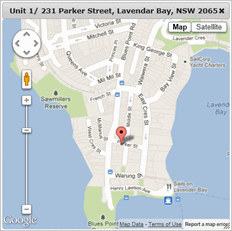 Map Control showing the address on the map |
| CopyFrom List | Top of page |
| Gauges | Top of page |
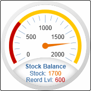 Radial Gauge illustrating Stock Balance |
 Linear Gauge illustrating Stock Balance |
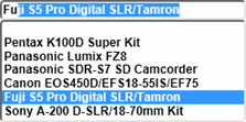
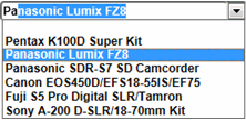
| CTC ComboBox Control | Top of page |
 CTC ComboBox Simple List always visible, Typing allowed, AutoComplete enabled |
 CTC ComboBox DropDown List drops down, Typing allowed, AutoComplete enabled |
 CTC ComboBox DropDownList List drops down, Typing not allowed, Selection only, AutoComplete disabled |
 Standard CTC ComboBox |
 CTC ComboBox with Item Number and Icon |
 CTC ComboBox with Item Number, Icon and Formatting |
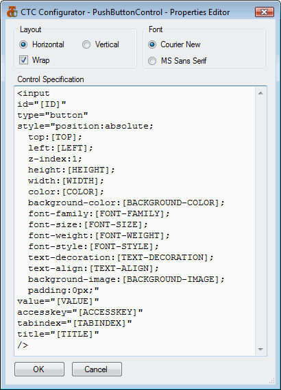
| Configurable Controls | Top of page |


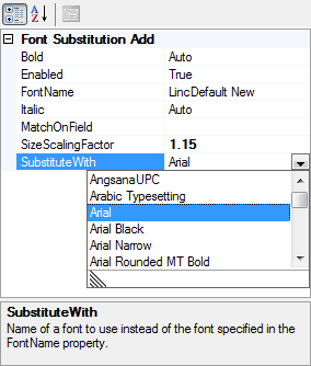
| Font Substitution | Top of page |
| CopyFrom as Grid | Top of page |
| Tab Groups | Top of page |
| Toolbar | Top of page |

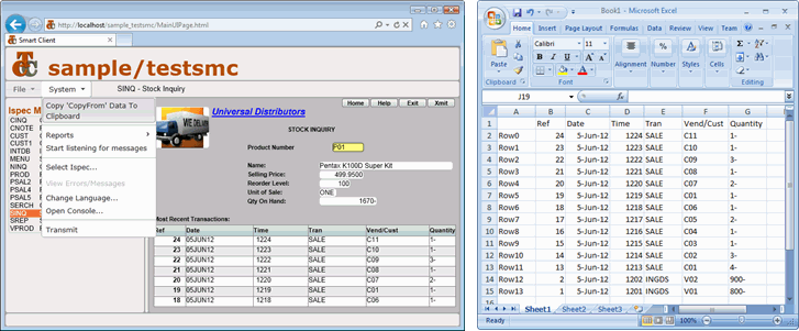
| Copy to Clipboard in Excel Format | Top of page |
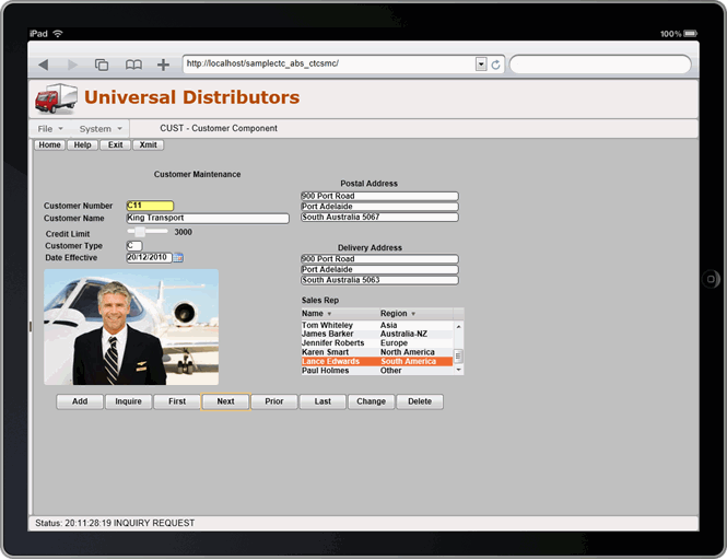
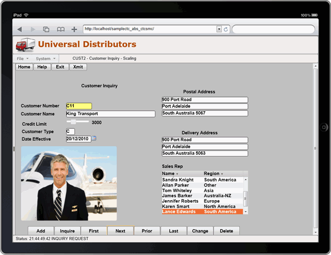
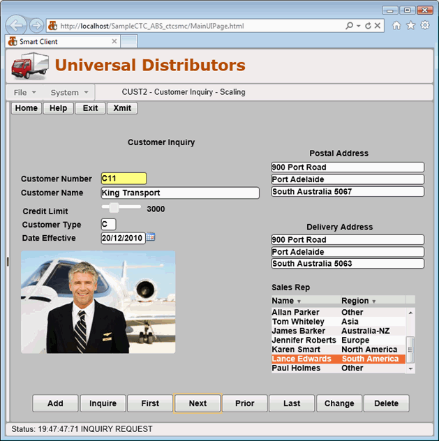
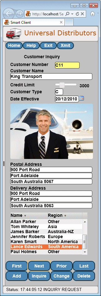
| Scaling | Top of page |
| Alternate Views | Top of page |
 Alternate View after Layout Changes |
 Alternate View on iPhone after Layout Changes |
| External Data Files | Top of page |
| Automatic Setup of Application Infrastructure Files | Top of page |
| Automatic Compile and Build of the Generated Application | Top of page |
 As part of the generate process, the generator can automatically compile the generated application and build the necessary dll's. This is achieved using MSBuild, the build platform from Microsoft used by Visual Studio. Together with the option for configuring the Runtime parameters, this means the application is ready to deploy when the generation of the user interface application is complete.
| Keep Session Alive | Top of page |
| System Trace | Top of page |
|
This web site will be updated regularly with the latest details. | Last update: 25th January 2026
Copyright © 2026 Client Tools Consultancy. | All rights reserved. |